Behind the Art: A Look Into the Board Graphic Design Process
Have you ever wanted to display a snowboard graphic like a piece of fine art?
It's a pretty common sight to see a snowboard hanging up in any die-hard rider's home. When you consider the months our hardgoods designers spend on each design, collaborating with artists and pro riders, it only makes sense that the finished product would be displayed as artwork on your living room wall. This year, we sat down with Jackson Tupper and Lesley Betts from the product team to talk about how they created this season's most impressive pieces of ridable art.
The Free Thinker and Deep Thinker
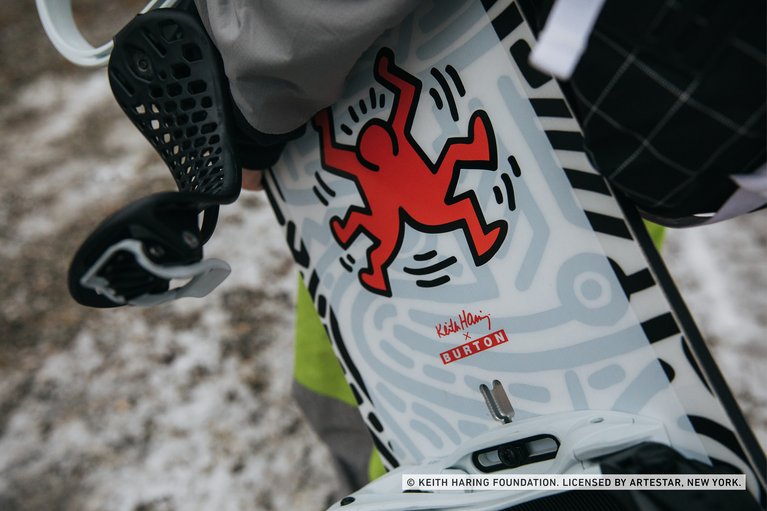
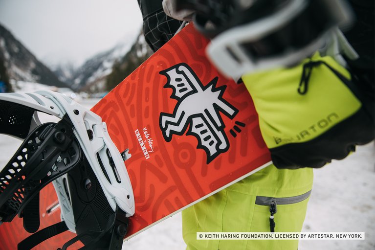
Recognize that dancing figure surrounded by thick, black squiggles? Yeah, we thought so. Keith Haring's artwork emerged out of NYC's street culture in the 80s and became one of the most famous forms of pop art in the world. Our hardgoods designers had their eyes on Haring's work for a while. With a green light from Danny Davis, the newest Thinkers were born.
Jackson described the process, "We provided Danny with a sheet of Keith Haring's artwork and he went through and selected his favorites. Then we started to pull together the pieces. We went through many different comps and we'd bounce each version off Danny. In the end, he was in charge of picking the final graphics."
The Kilroys
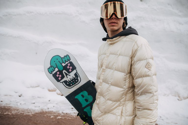
The Kilroys are all about having as much fun as possible–so their board graphics have match their vibe. To create this year's designs, the design team whipped up a social experiment to get inside the heads of these riders and figure out what they were all about.
Jackson was stoked about working with the Kilroys to create a fully rider-driven design. "With the Kilroys, we started this process by sharing a book of images. We asked them to circle things they liked, told them to draw on the pages, whatever. Then, they sent it back to us with their top picks. This gave us a really good idea of what they were into." It turns out, their minds are similar to most teenage riders. The common themes from the test: skulls, girls, punching, and bright colors.
One of the Kilroy's favorite images came from the Artist, Bryce Wong. Wong is know for his quirky combination of ironic and clever graphics. When asked to collaborate, he was super down to help Jackson create a board that was 100% pure Kilroy.
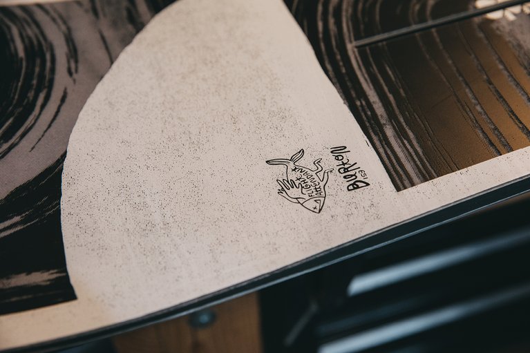
The Flight Attendant
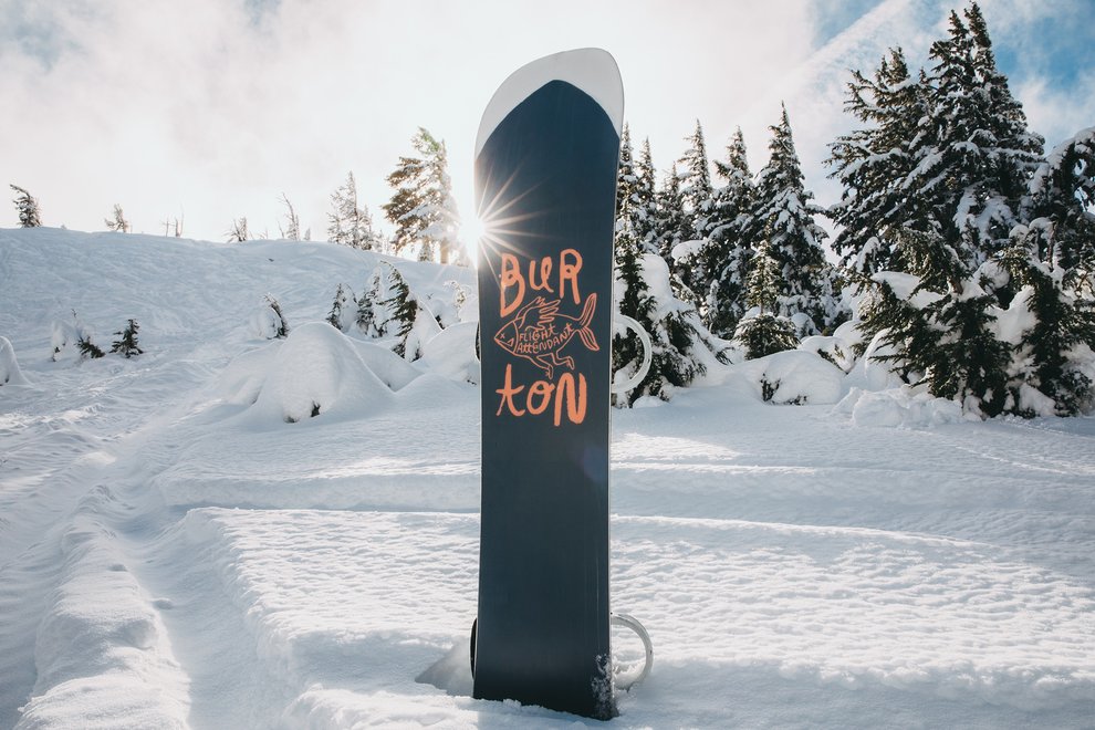
The graphics on the Thinkers and Kilroys are mostly rider driven, but the Flight Attendant took a departure from that model. This year's graphic was fully inspired by Ty William's art. Lesley and Jackson explained that working directly with an artist can be a little nerve-wracking. In the beginning, you have to reach out to the artist to see they are on board with the project.
"We found a bunch of his work and thought that he would be awesome to collaborate with. So, we made some comps of what his art would look like on a board and reached out to him. We showed him the examples and said, “Hey, we want to work with you. Here is a design we made using your art. Would you want to work with us?” And he was down."

Working with artists is not always easy. Luckily for our designers, Ty is a super laid-back guy. Jackson explained that, "Ty is a surfer who grew up in Maine. He surfs the world, so his artwork is very loose and flowy. He does a lot of nature themed stuff with an abstract spin.
Jackson and Ty spent some time reviewing rounds of designs until they landed on the earthy, dark tones and ocean inspired graphics. "I wanted to capitalize on that with the Flight Attendant because it's an all-mountain board that lets you surf the whole mountain. His artwork seemed like a perfect fit. That’s when the composition for the fish tail came up. I tried to make it look like an old school surf board."
The next time you find yourself in the market for a snowboard, take a second to really appreciate the work and artistry that goes into every design. There is a graphic out there for every rider, no matter if you're interested in famous works of art, skulls, or surfy designs. Who knows, maybe one of this year's favorites will end up hanging in the halls of your home?